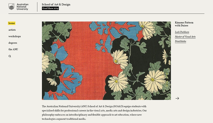
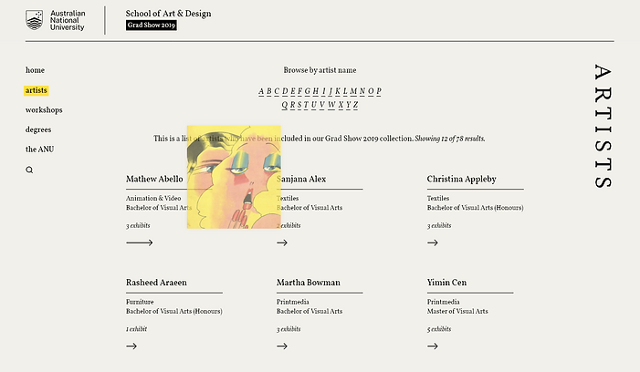
Logo

ANU SOA&D Grad Show

project type

Web & Mobile Design

client

ANU SOA&D

my role

Research & design

tools

Adobe XD

overview & goals

The ANU School of Art & Design grad exhibition is a key event that contributes to the profile of the school. The SOA&D Grad Show website showcases the final projects of the graduating class online. The primary goal for this project was to organize the content into categories such as exhibitions, degree, and student name, making it easy to navigate the large collection of artworks. Additionally, the design aimed to evoke the feel of a beautiful catalogue or poster that enhances the artwork and brings it to life.

Final Design

The final interface features thoughtful content structure and a minimalist design that fully showcases the talent of the graduating students. It blends form and function, offering smooth interactions that allow visitors to explore the exhibits with ease. Experience the interface for yourself in the walkthroughs below.

Mindful of the significant portion of our audience that would access the website via mobile, I took a mobile-first approach and aimed to craft a design that speaks volumes on small screens.


The final website seamlessly blended design elements with mobile design standards.

Research Process

I began my research by exploring the information architecture, navigation and design conventions used by similar websites. Art galleries often display a large collection of artworks from multiple artists, organized into categories such as exhibitions, location, or time.

By studying how such websites handle their content, I gained valuable insights that guided the design of the SOA&D Grad Show website. I grouped the content based on workshops and degrees, allowing users to easily search for exhibits by degree or workshop name. ​

Below are some of the websites I researched, as well my key takeaways from them:

1. Cecelia Brunson Projects

The homepage of Cecilia Brunson Projects, a South American art gallery in London, features a fixed menu on one side and an elegant image carousel displaying one main image at a time. This design prioritizes accessibility and highlights important artwork or events the gallery wishes to promote.

This screenshot from my final design reflects the inspiration drawn from Cecilia Brunson Projects, while preserving the unique visual style I chose for the SOA&D Grad Show website. It incorporates an image carousel to focus visitors' attention without overwhelming them with excessive links and images. The fixed navigation ensures an smooth, accessible journey for visitors as they explore the site.

2. Domobaal

This is an individual artist page from Domobaal, a London-based gallery. The site uses pagination for images rather than the common continuous scroll. Users can choose to read more info, or view more works by an artist without having to scroll past a lot of content to find what they want. I liked this approach, especially as I envisioned an efficient, minimalist layout for the SOA&D Grad Show website.

The Domobaal website has not been adapted well for mobile; the menu is too small, and it is very hard to click the pagination links. This mobile site is an example of what not to do in terms of responsiveness.

3. Museum of Modern Art [MoMA]

The MoMA artist page highlights an essential design choice: arranging elements in a grid format to optimize space, which is especially important for websites with extensive artist listings. While I aspired to use a similar content structure for the SOA&D Grad Show website, I also wanted to infuse it with interactivity and colour. As a solution, I opted to reveal an artist's featured work with a hover effect.

This screenshot is from my final design. As shown, hovering over artist Mathew Abello's name reveals an artwork of his, offering a glimpse of his work without the need to click. This allows users to decide whether to explore further. It is also similar to a real gallery experience where visitors can glance inside a room before deciding to explore the artwork within it.

4. National Gallery of Victoria [NGV]

This screenshot from the NGV Collection page, shows a search bar and alphabetical pagination. I recognized the importance of providing easy access to content so I added an alphabetical navigation of artists to the SOA&D website.

The mobile version has page elements adjusted for screen size. Compared to the desktop version, the link text has been enlarged, making it easier to spot and click. I took note of these features so that our final mobile design remained accessible while preserving the aesthetic elements of the desktop version.

Ikonik IconIkonik Icon

Design Process

For the SOA&D Grad Show web design, I took inspiration not from another website, but from a set of flyers by Japanese artist Akira Kusaka. I chose these posters as my design inspiration because I wanted to employ neutral colours without it being ‘black-and-white’. I also wanted the website to resemble a poster, with text around the page that describes and interacts with the images shown.

These flyers are minimal and generally follow design rules like the use of grids, but occasionally ‘break the grid’ with elements such as vertical text, adding intrigue and visual interest.

Deliverables

After conducting thorough research and drawing inspiration from both websites and visual art, the final product was designed in Adobe XD and developed using HTML and CSS. Below, you can find PDFs of the wireframes and final webpages, capturing the process of the SOA&D Grad Show website from concept to completion.