Logo

Bolstreet B.V.

project type

Branding & Web App Redesign

client

Bolstreet Amsterdam

my role

Research & design

tools

Figma, Adobe Illustrator, Tailwind CSS

overview & goals

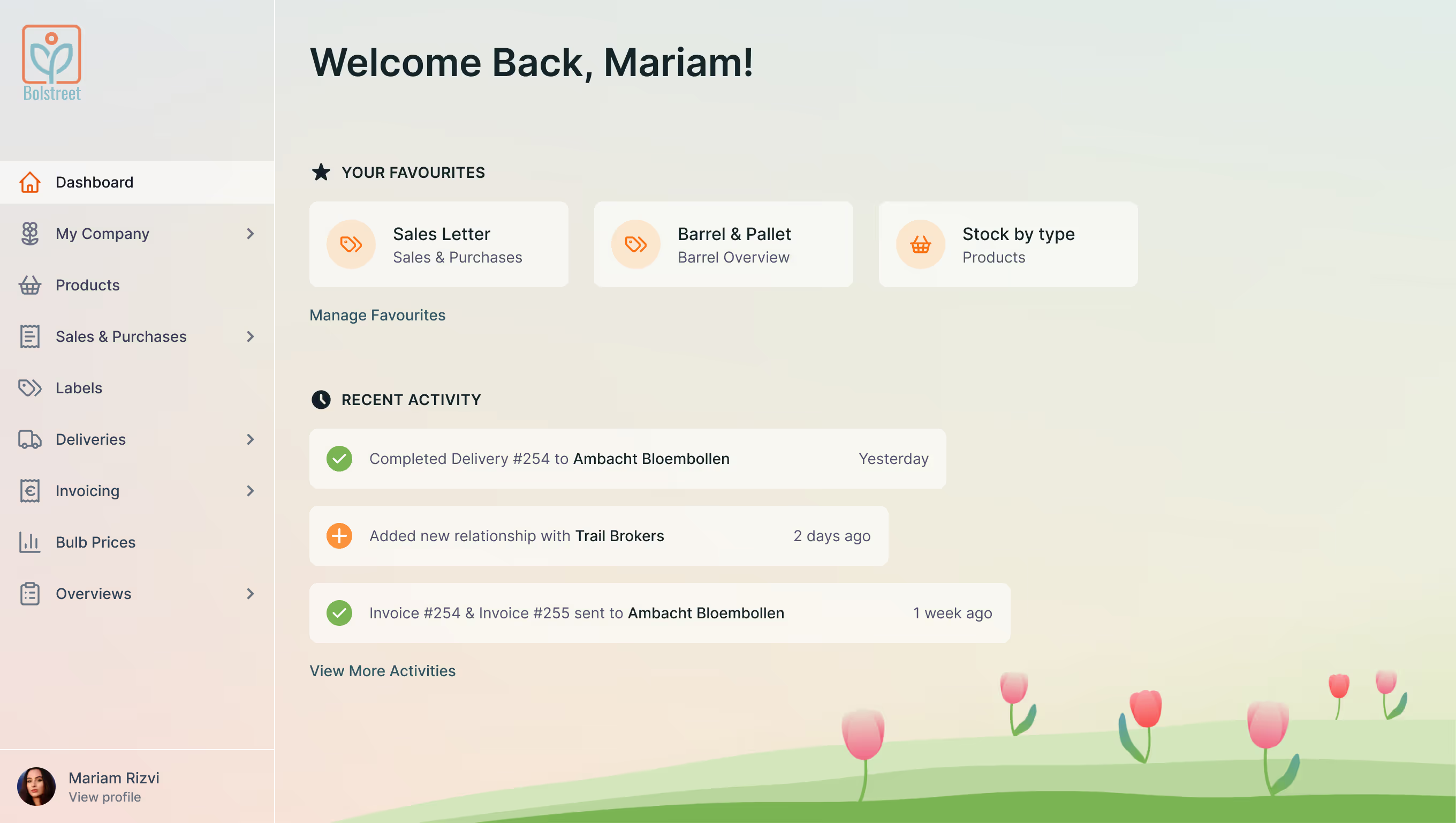
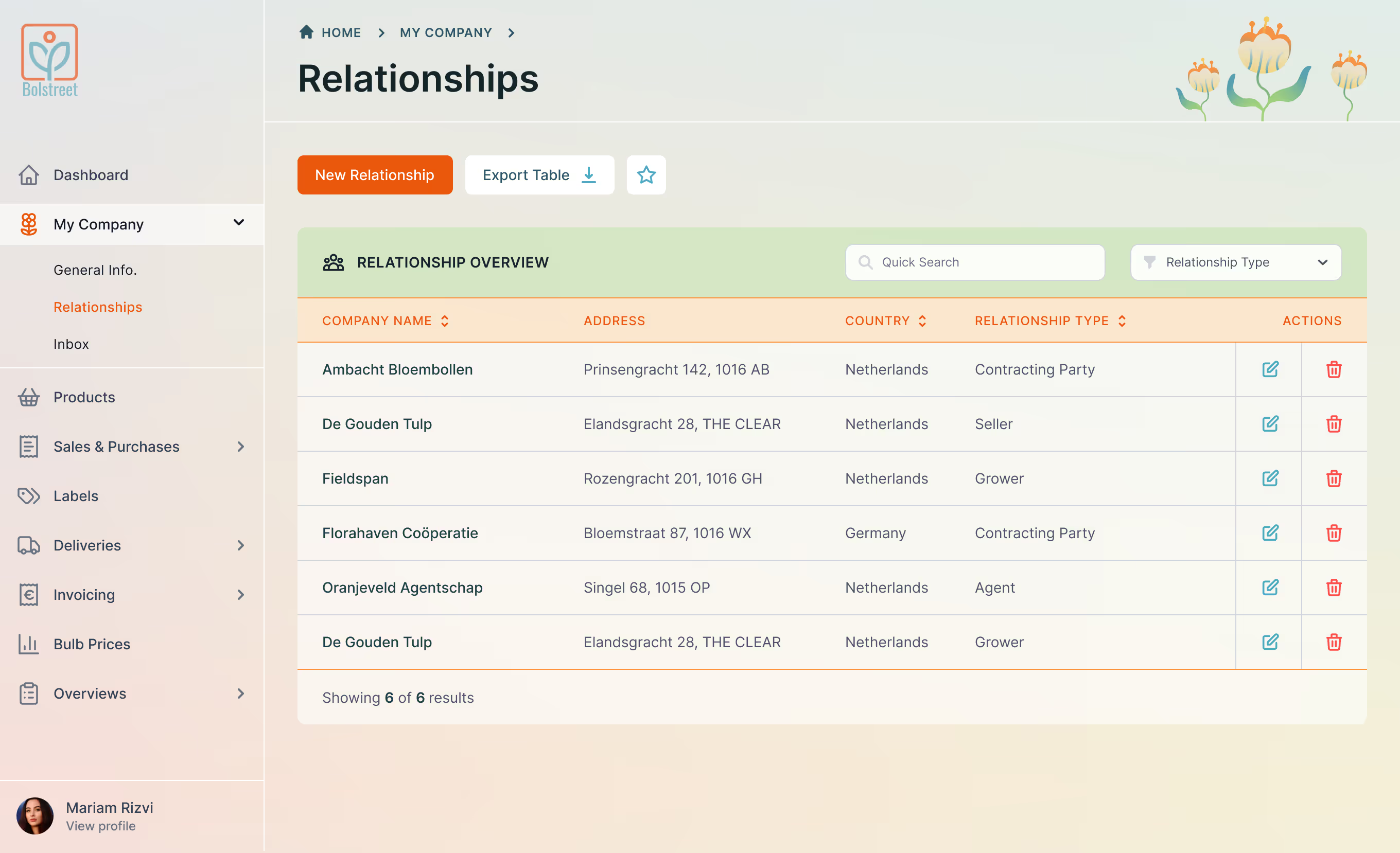
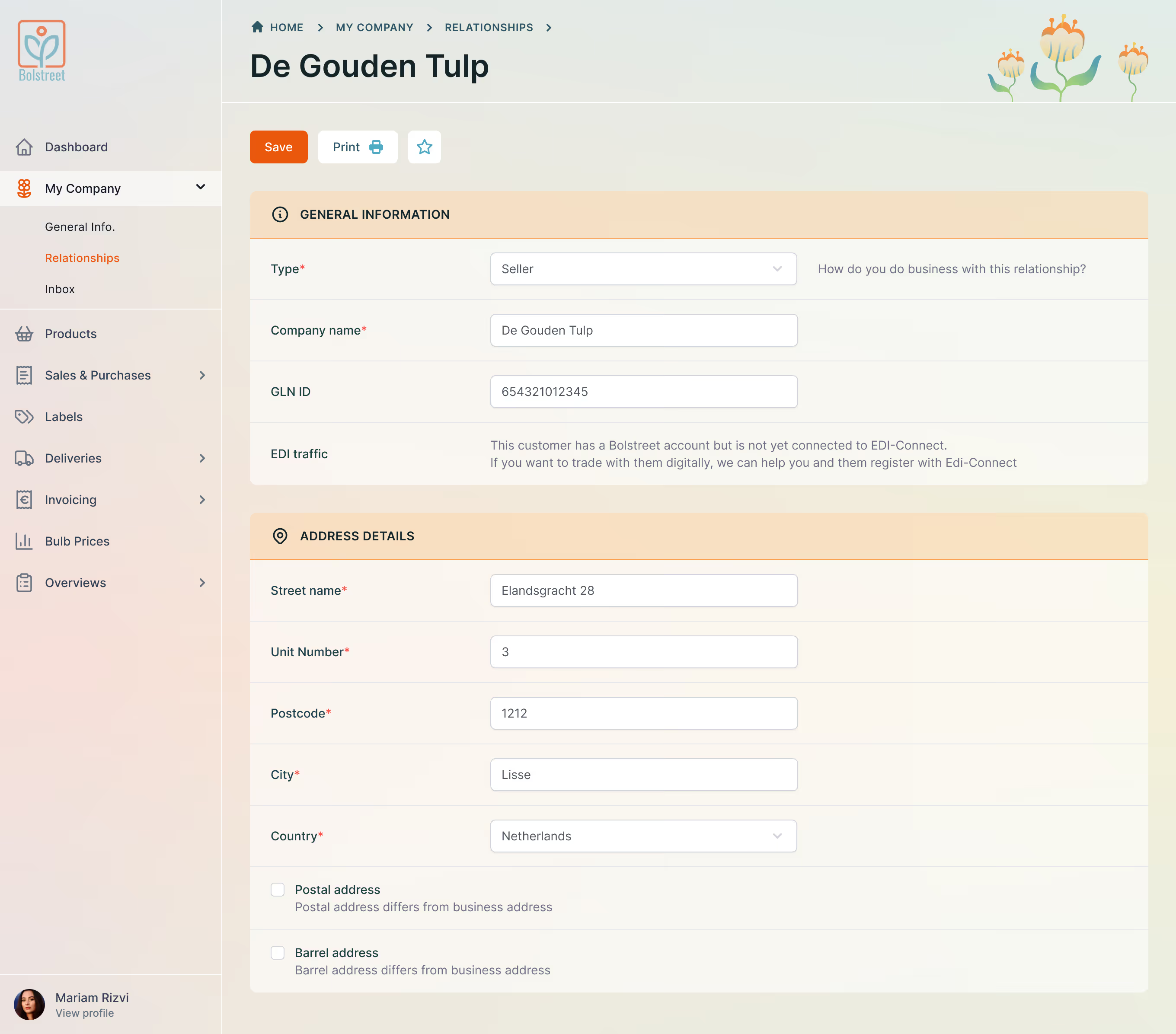
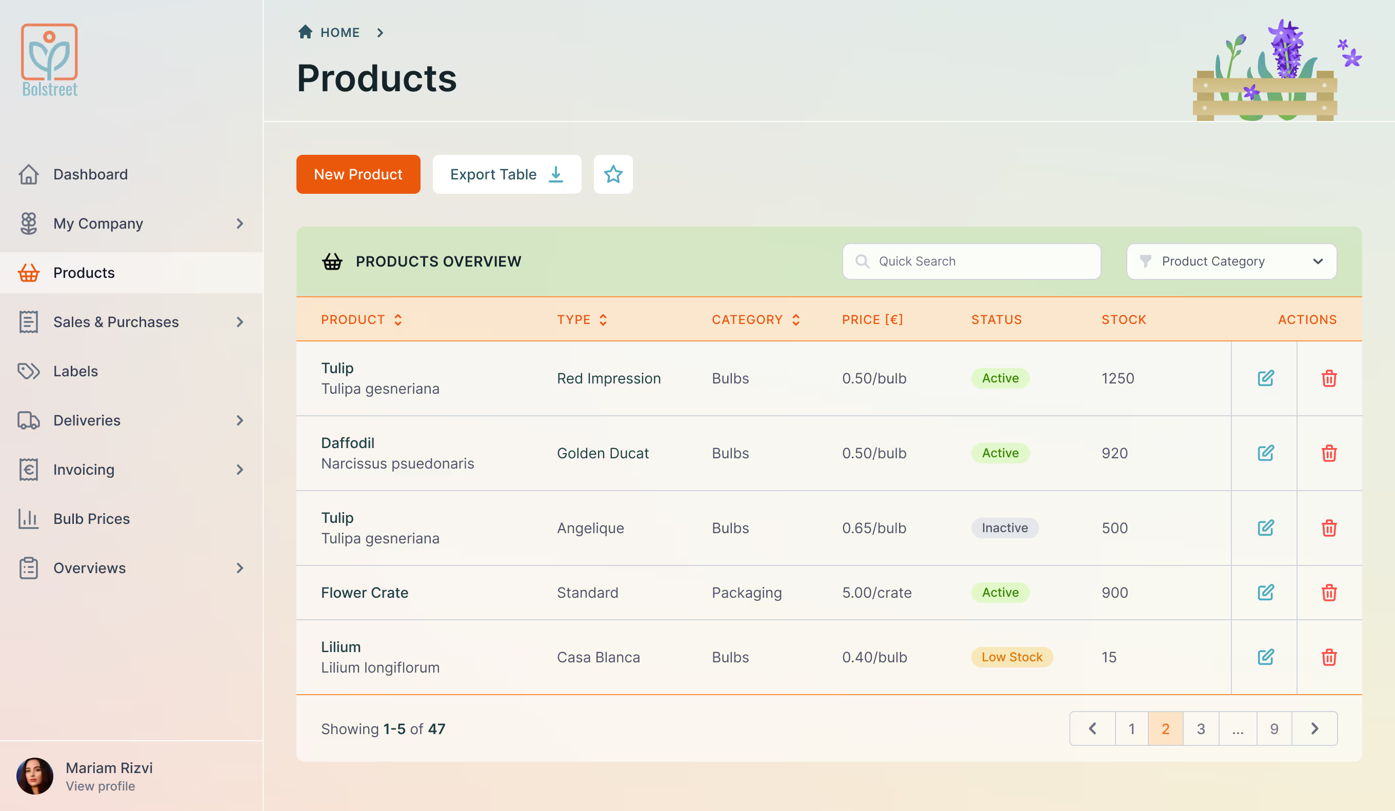
Bolstreet creates cloud-based software for flower-bulb and perennial growers, helping teams manage cultivation and logistics from anywhere. The goal of this project was to modernise the customer portal ahead of an upcoming Laravel + Tailwind build. I worked with users and key stakeholders at Bolstreet, as well as a collaborating graphic designer, to create a cohesive design system, header illustrations, and a scalable layout that could support future growth without adding visual clutter.

Design Elements

The Bolstreet interface uses a calm visual language designed for daily, long-term use. A restrained colour palette, soft contrasts, and clear hierarchy help reduce visual fatigue while keeping data easy to scan. All components were designed to feel modern without drawing attention away from the core workflows.

colour scheme
#4EAAC2
#2E5761
#f4cd61
#F39142
#ea580c
#7BB453
#f66985
iconography
Iconography for the Bolstreet portal
buttons and cards

UI blocks such as buttons and cards were designed as part of a consistent component system to ensure visual continuity across the platform.

Final Design

The final Bolstreet customer portal features a calming interface that is easy to navigate, supports future feature growth and works equally well for new and experienced users.

01

Login & Access

Authentication

Bolstreet authentication screen with sign-in form

02

Dashboard

Overview

Bolstreet dashboard showing sidebar navigation, favourite shortcuts and recent activity overview

03

Relationships

Overview

Relationships page with searchable table of companies, including address, country, relationship type and action icons

04

Relationship Details

Detail View

Relationship detail view showing general information and address fields within the Bolstreet portal

05

Products

Inventory Management

Products management page with inventory table showing product name, category, price and pagination

Process

1. requirements and constraints


User requirements

The interface needed to remain uncluttered and easy to navigate, supporting different preferences such as a text-light and icon-heavy layout. A left-hand navigation was essential to help users quickly access key sections and improve overall workflow.

Business & technical requirements
From a product and development perspective, the system needed to be modular, scalable, and fully compatible with a Tailwind-based build. The visual direction focused on a modern, calm interface, using a restrained colour palette and minimal illustrations that would remain clear as features scale.

2. system and visual direction


UI system design

I designed a scalable UI system using Tailwind’s responsive building blocks. The system covered navigation, section layouts, tables, and forms, with reusable components designed to stay consistent across the portal and support new features without adding visual complexity.

Visual language & illustrations
Alongside the UI system, I defined the overall visual language, including colour usage, icons, and illustrations. I guided the collaborating graphic designer to ensure the illustrations aligned with both the system and Bolstreet’s existing logo and brand language.

Bolstreet dashboard showing modular UI system with sidebar navigation

3. collaboration and delivery


Stakeholder collaboration
I worked closely with both technical and non-technical stakeholders throughout the project, incorporating feedback through mid-project check-ins to keep the design direction aligned.

Handover & implementation
The final designs were developer-ready and easy to implement. To support a smooth handover, I presented the final Figma file alongside a short video walkthrough, ensuring all stakeholders could clearly understand the design decisions and intended behaviour.