Research Process
I explored the streets of Canberra to discover the best locations for my guidebook. My research methods included:
- Revisiting three iconic locations and observing visitors taking selfies or getting their photos taken.
- Doing informal interviews with these visitors to gauge photogenic factors of these spots.
- Polling social-media savvy friends on what makes a backdrop or artifact Insta-worthy according to them.
This research resulted in the following insights that guided me through the design phase:
- Visitors at these locations were mostly young and half were tourists, confirming target audience.
- Informal interviews revealed 4 lesser-known photogenic locations for the guidebook.
- Friends gave tips for choosing Insta-worthy backdrops as well as other criteria they consider when taking social media photos.
These valuable insights helped me to pick the perfect locations and develop a design language for my guidebook.
Design Process
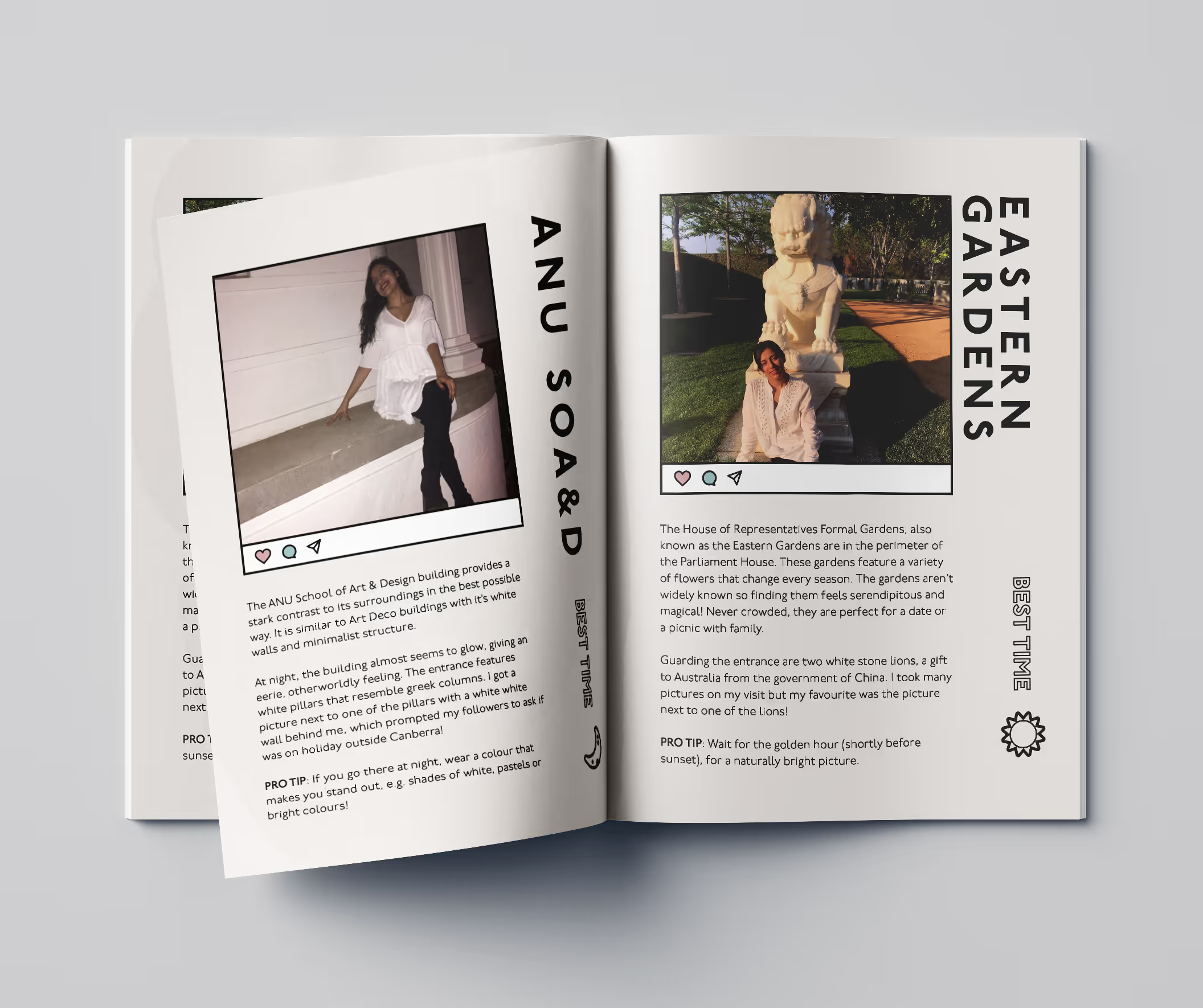
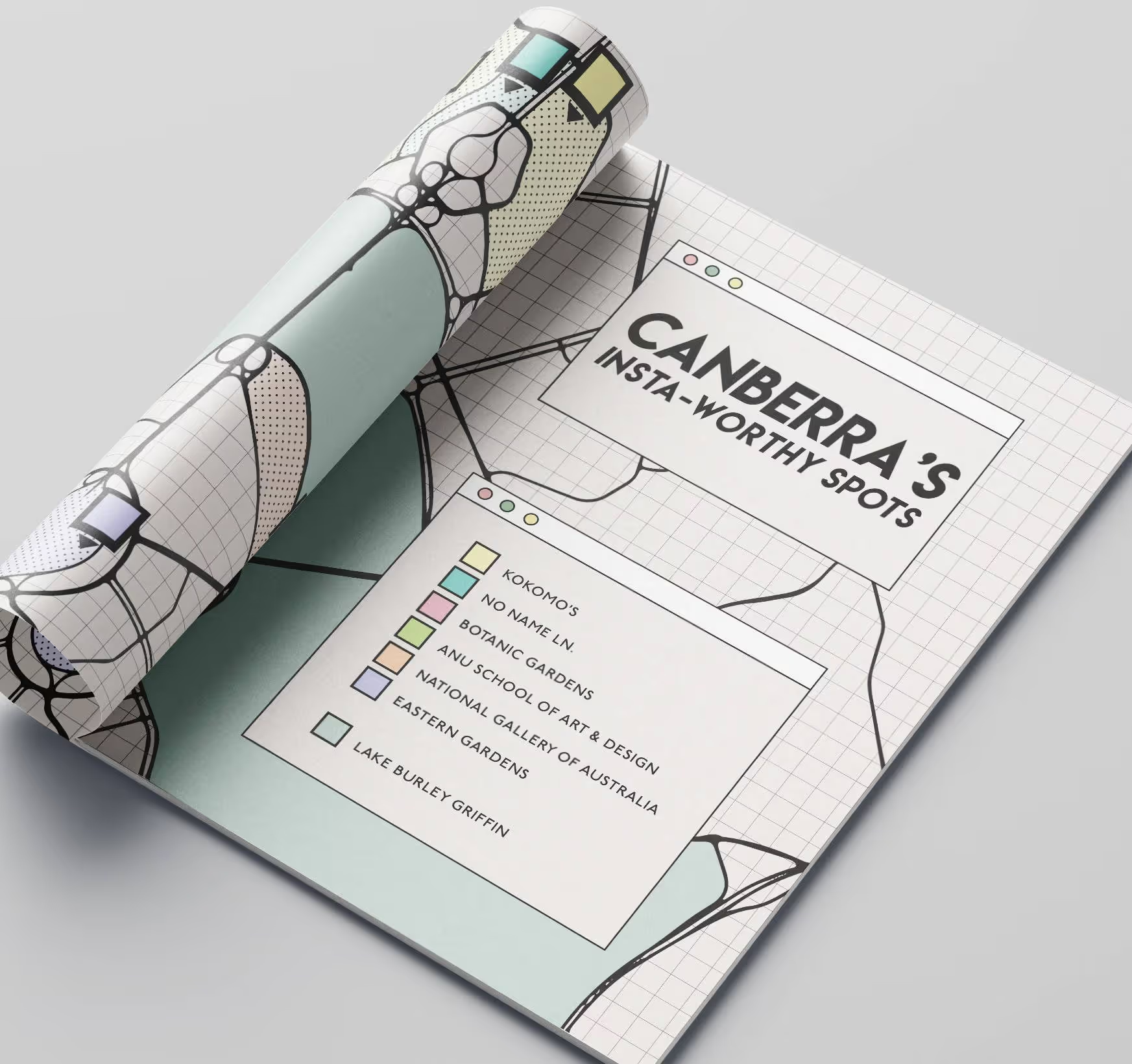
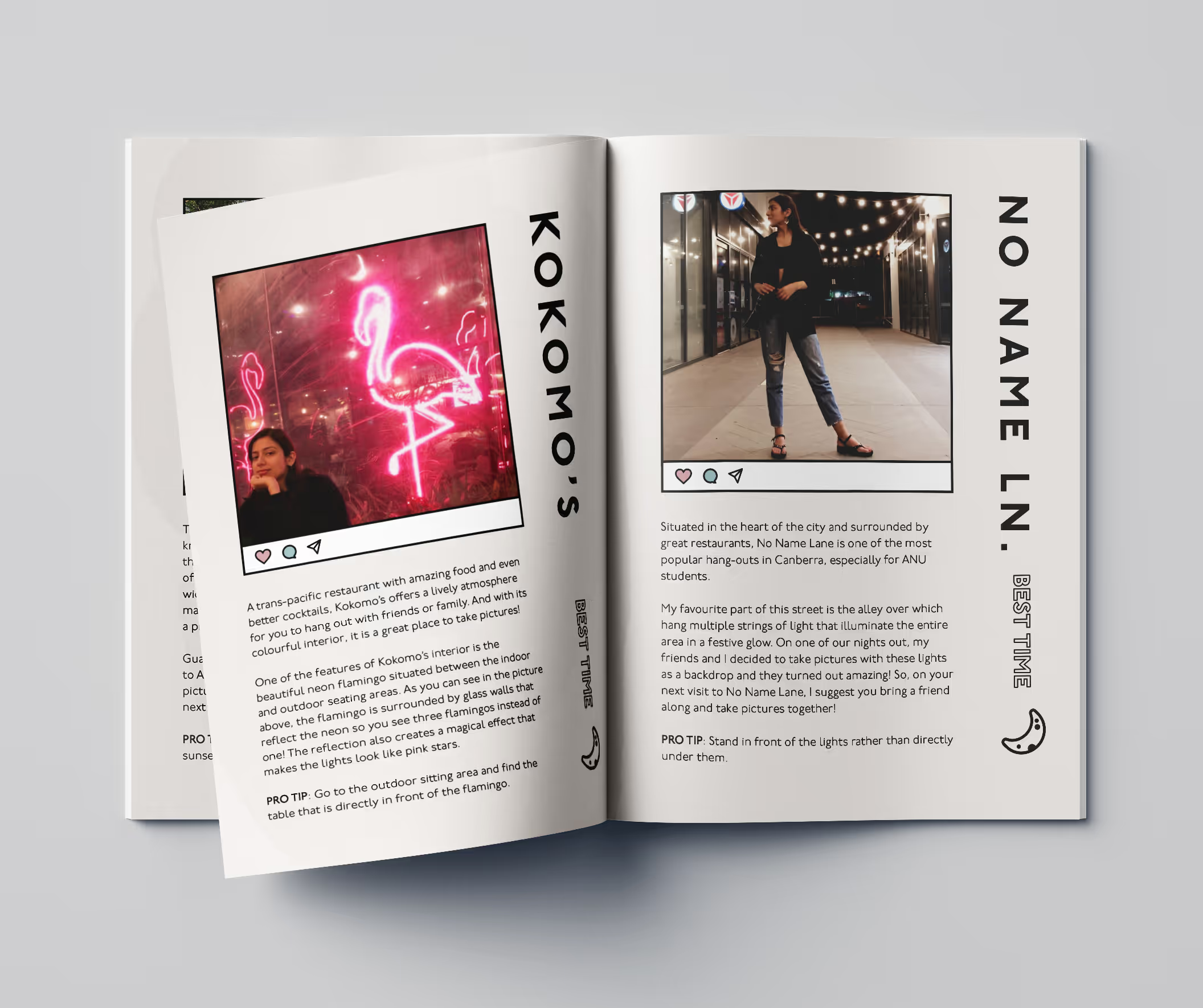
The final design features a clean and minimal layout, inspired by the look of an Instagram page. The map was hand-drawn, then edited on Illustrator. I included social media-inspired icons and symbols in the guidebook. Every design choice was based on my research and creative findings.
mood board
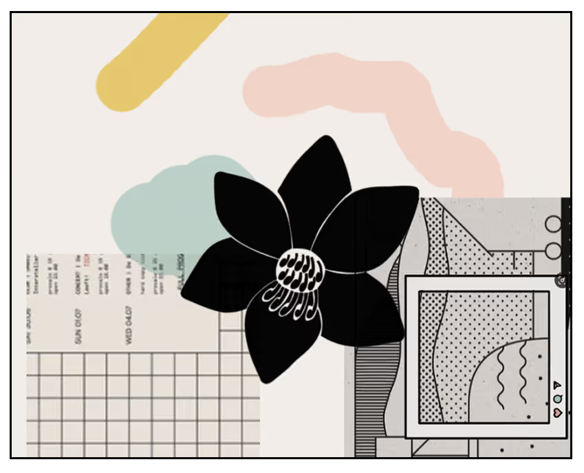
I began the design process by revisiting key design principles, studying guidebooks with similar themes and exploring Pinterest. This research resulted in a Pinterest board and a mood board which I referred back to throughout the design process.

hierarchy
I chose to present hierarchy through text and colour. The title for each location is black and much bolder than the rest of the font. This is also true for the map. The other colours used in my design are mostly pastels, which why the headings stand out.
iconography
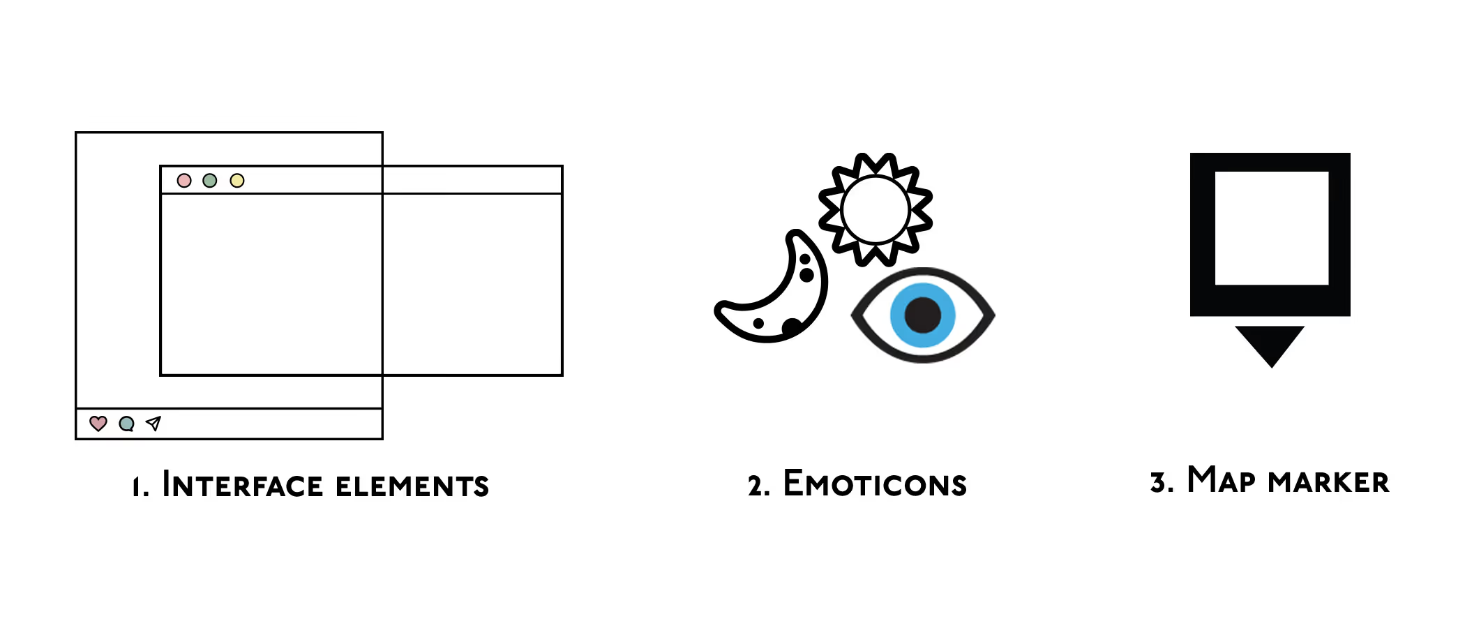
The interface elements and emojis make a connection to social media for the reader. The map marker both symbolizes the Instagram theme and helps readers understand its purpose.


.avif)
.avif)
